I started this blog as a way of sharing the inspiring ideas and images that come my way through my work as an interior designer. I’m constantly exposed to new artists, products and spaces that help to shape my perspective, and I’m thrilled to share them with you. You can also sneak a peek at what I'm currently working on by following my Instagram. Thank you for visiting and enjoy!

To search past blog posts or look for a specific project, enter key words below.

Enter your email address:

Delivered by FeedBurner

Tuesday
Mar152016

Selling a Pair of John Robshaw Chairs


A beautiful brand new pair of chairs are in need of a new home. We had these made for a client's living room, but after deciding to add built-in bookcases, they no longer fit. They are upholstered in Aleppo Indigo John Robshaw Linen with painted grey legs on casters. They're really special, and I would keep them if only my little apartment had room.

Dimensions are: 33"w x 36"h x 29"d
Seat Space: 21"w x 18"d x 20"h

Email me with any questions or interest. sara@saralowman.com

Thursday
Mar052015

Little Window Into My World

It's been almost a year since my last post, and it's been pretty busy for me and my little growing business. I got engaged last year, and planning a wedding on top of running a business has proven to be quite an undertaking--fun, of course, but let's just say that I may have seen my fiancé's eyes glaze over once or twice when dinner conversations turned to tile patterns on a project or whether he liked garden roses.

One of my New Year's Resolutions (Is it March already?) is to update my website to show some of the work I've been doing. It will take a little time, but I thought these images were a fun sneak peek. That's not a ghost in the bottom pic; it's me trying to get things styled properly for a photograph and not realizing the photographer was taking a photo with a long exposure. Oops!

I thought the photo was funny because it shows a little bit of the juggling act behind the scenes in the world of interiors. There are a million little details that make a room feel good. From wallpaper to lighting to the way a bed is made, it all creates a visual experience. I liked mixing modern furniture lines with a whimsical wallpaper pattern, and I think we created a nice masculine/feminine balance (it's a Master Bedroom).

Hoping to have more to share this year. Stay tuned!

Sunday
Mar232014

Bocci

I'm working on a project with a concrete ceiling right now. As a solution for a lack of overhead lighting, we are building soffits which will house recessed lights as well as pendants for over the dining table. The tricky part is, the architecture of the space (diagonals, window placement etc...) makes it difficult to place a fixture directly over the center of the dining table, so we're opting for something asymmetrical that won't be too heavy. That's how I came across the Bocci 21 Collection. Thin sheets of porcelain allow light to pass through, and each shape has slight variations that take on an organic look when assembled together. I'm hooked, and if I don't get to use them in this project, I will definitely be using them in my own home someday!

Wednesday
Nov202013

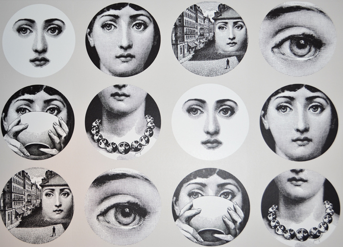
Fornasetti Wallpaper

I've loved Fornasetti for a while now. The face of Lina Cavalieri obsessively depicted a thousand different ways was charming, beautiful and mysterious, and I was hooked. The same sort of whimsical appeal runs throughout Cole & Son's Fornasetti line of wallpapers. From owls to tandem cyclists, there's something about them I can't resist. They would be great anywhere, but I would love to paper a closet or a powder room with these. It's just enough of the unpredictable to create a little element of surprise.

Sunday
Sep292013

Glass Tiles: Waterworks Repose

Allow me to introduce my latest obsession, Repose Glass Mosaic Tiles by Waterworks. I stumbled upon these when sourcing tiles for a recent kitchen and bath renovation. The client wanted bold color, but being a small NYC space, we wanted something that didn't feel too heavy. When we found the swirling sky-like tones of these tiles, we knew that we had found the perfect way to bring color into the space.

The tiles are made by hand, and they can be custom colored and even arranged in a custom pattern as you can see in the above backsplash photo. We used them as an accent wall in the bathroom, keeping everything else bright and white with floor to ceiling ceramic tiles. The kitchen colors were the same, but we used the graphic "elliptical flower" pattern to make it its own unique space. They have the most amazing reflective quality in person, and the light almost dances off them like water. This project is getting close to completion, so I hope to have more to share soon!

First two images from Waterworks, and the second two are sneak peeks from my project.